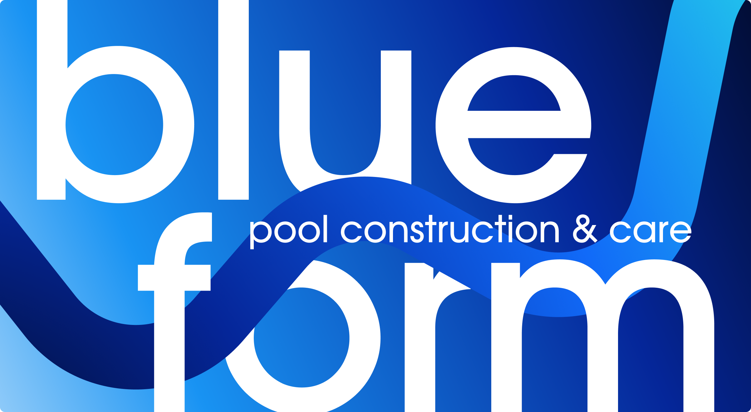
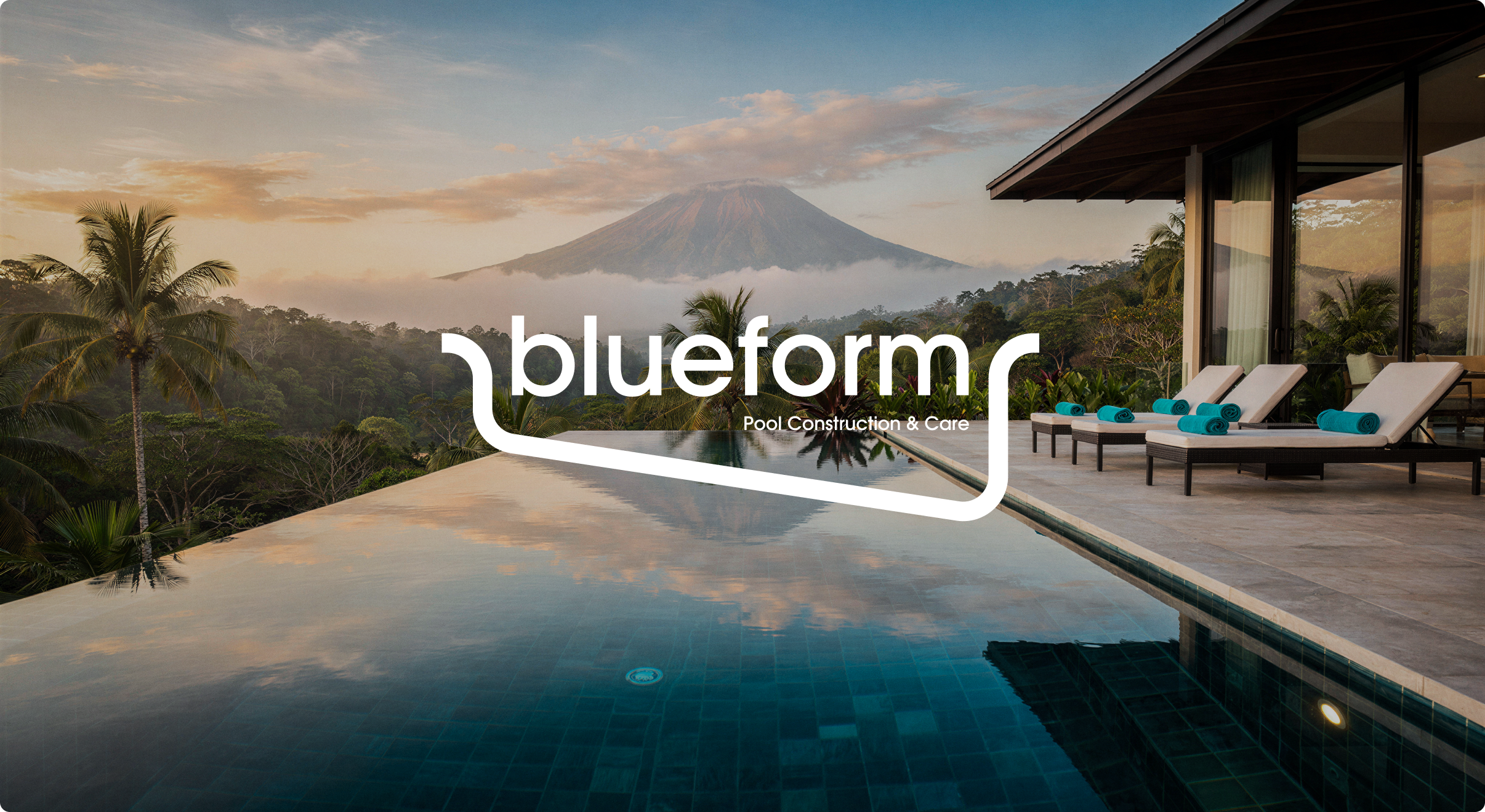
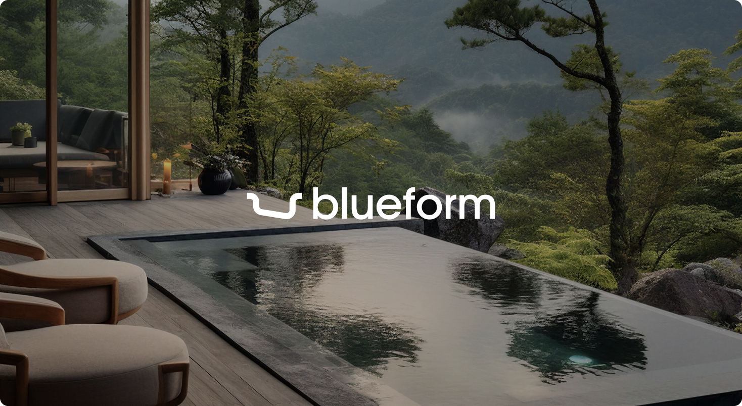
BlueForm needed to stand out in Asia with a European design language that feels modern, precise and memorable. We started from the name: the pool’s contour becomes the logo’s line – a signature that flows into patterns, wayfinding and packaging. Around it we built a system that makes technical depth look effortless.
task & context
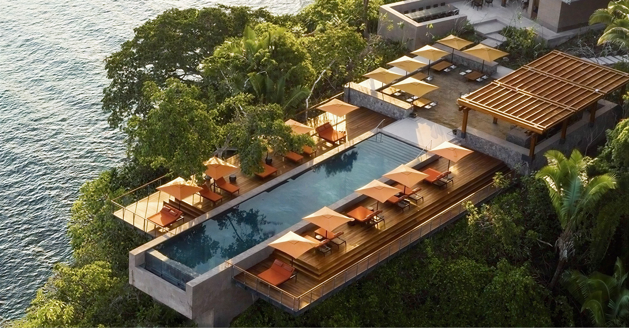
BlueForm builds complex systems: structural bowls, hydraulics, dosing, IoT monitoring. The brand had to look calm and premium while speaking clearly to owners and architects.
Task:
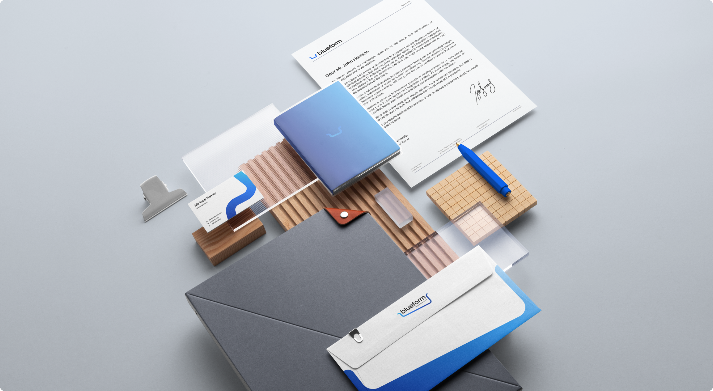
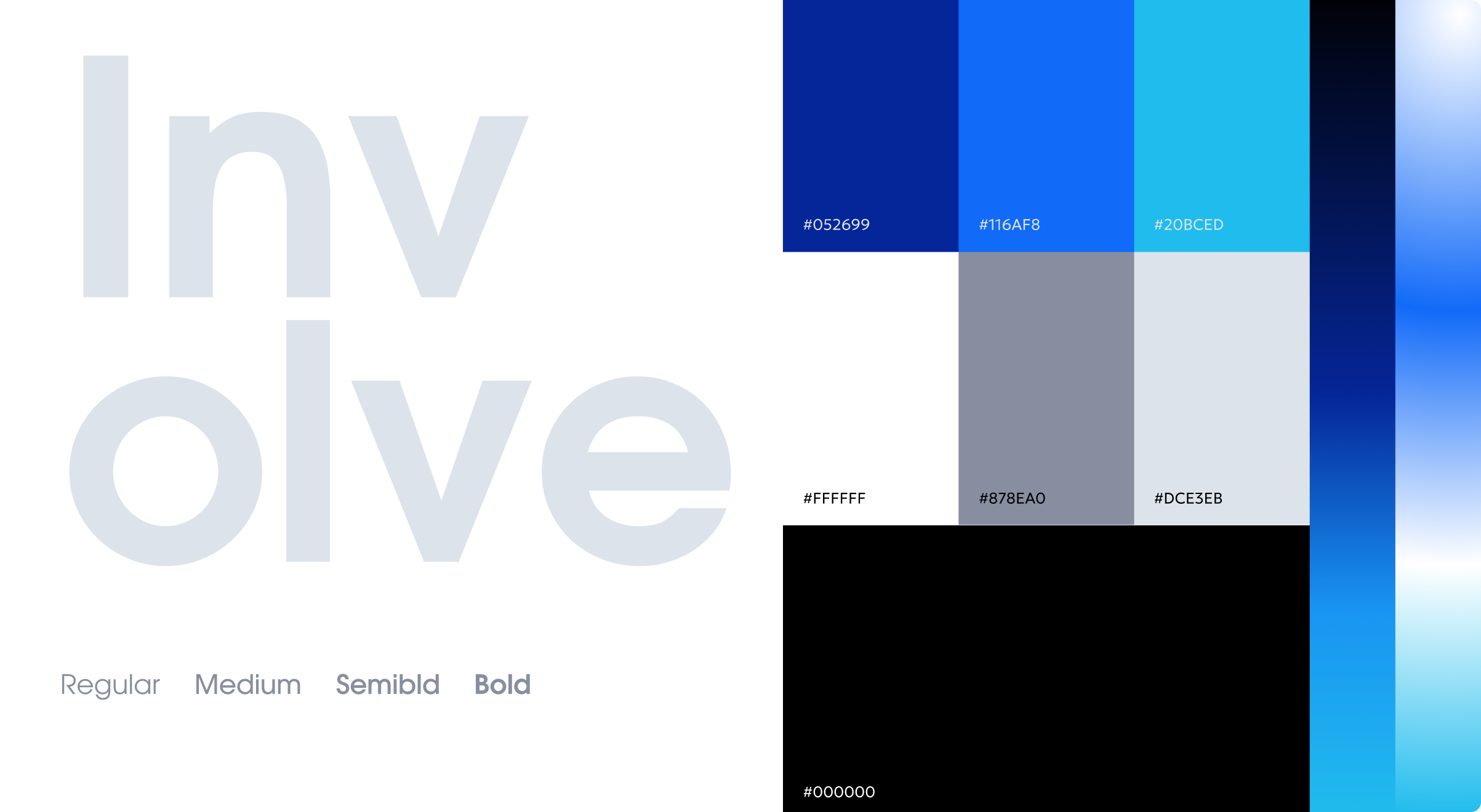
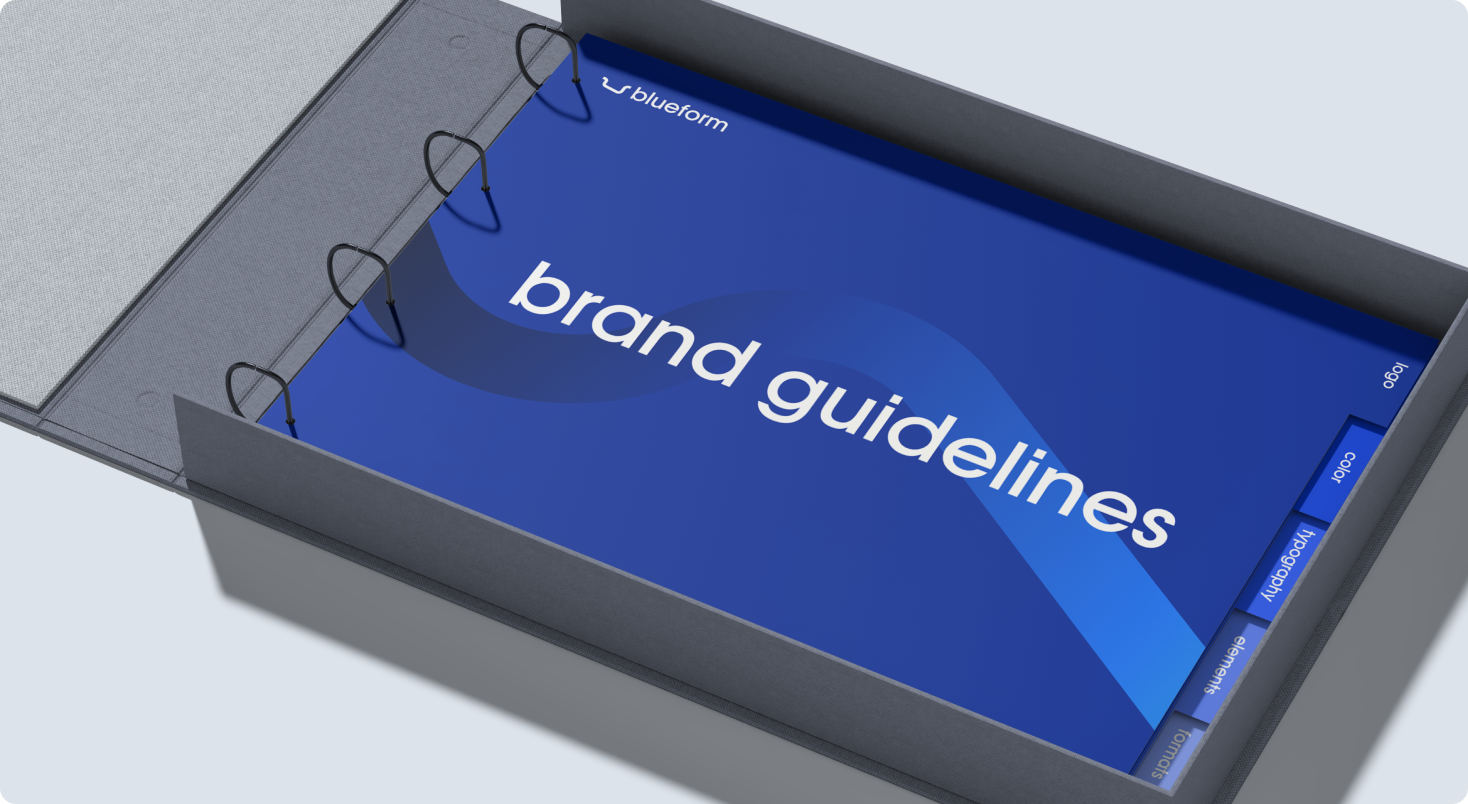
• Create a full identity – logo, typography, color & materials
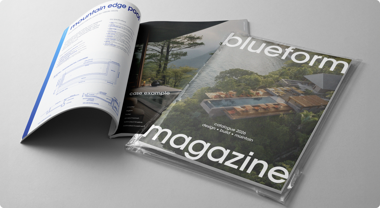
• Design product catalog and the BlueForm Journal (annual print)
• Develop certificates, warranty & service documentation kits
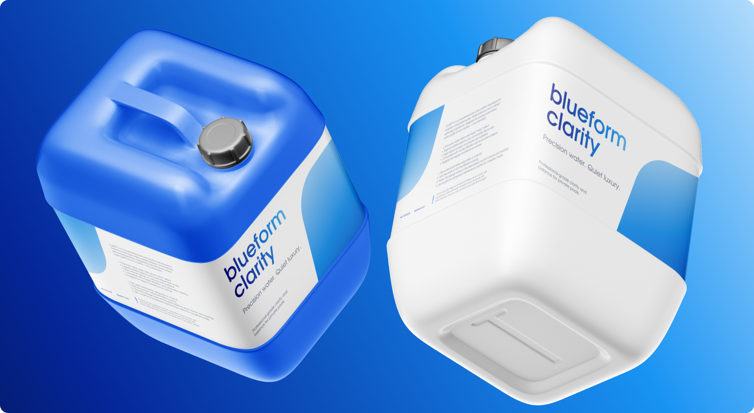
• Build packaging and label system for pool-care chemistry line
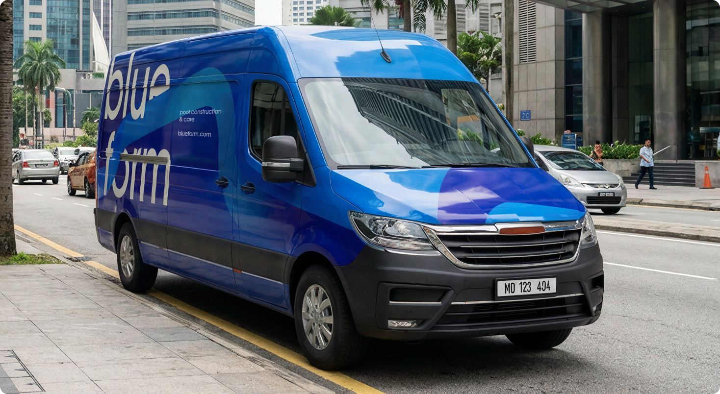
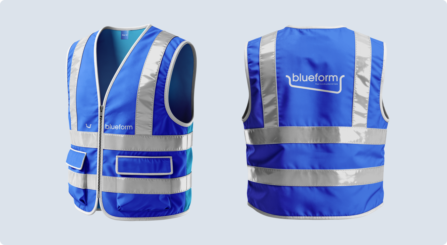
• Brand fleet livery and staff apparel; design stationery set (envelopes, cards, flyers, brochures)
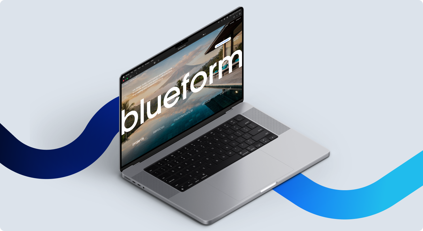
• Craft a clear, European-style website home (structure, UI key screens)
Context:
• Asia launch aiming to read “European-grade” in a visually noisy category
• Highly technical B2B specs + aspirational B2C storytelling
idea & concept
Key idea
“Water, Engineered to Belong”
The pool is treated as architecture: a form that must feel inevitable in the site – not an add-on.