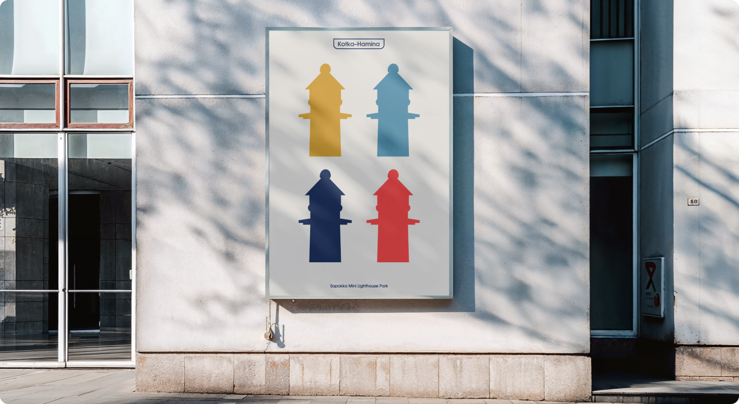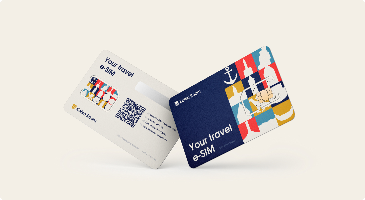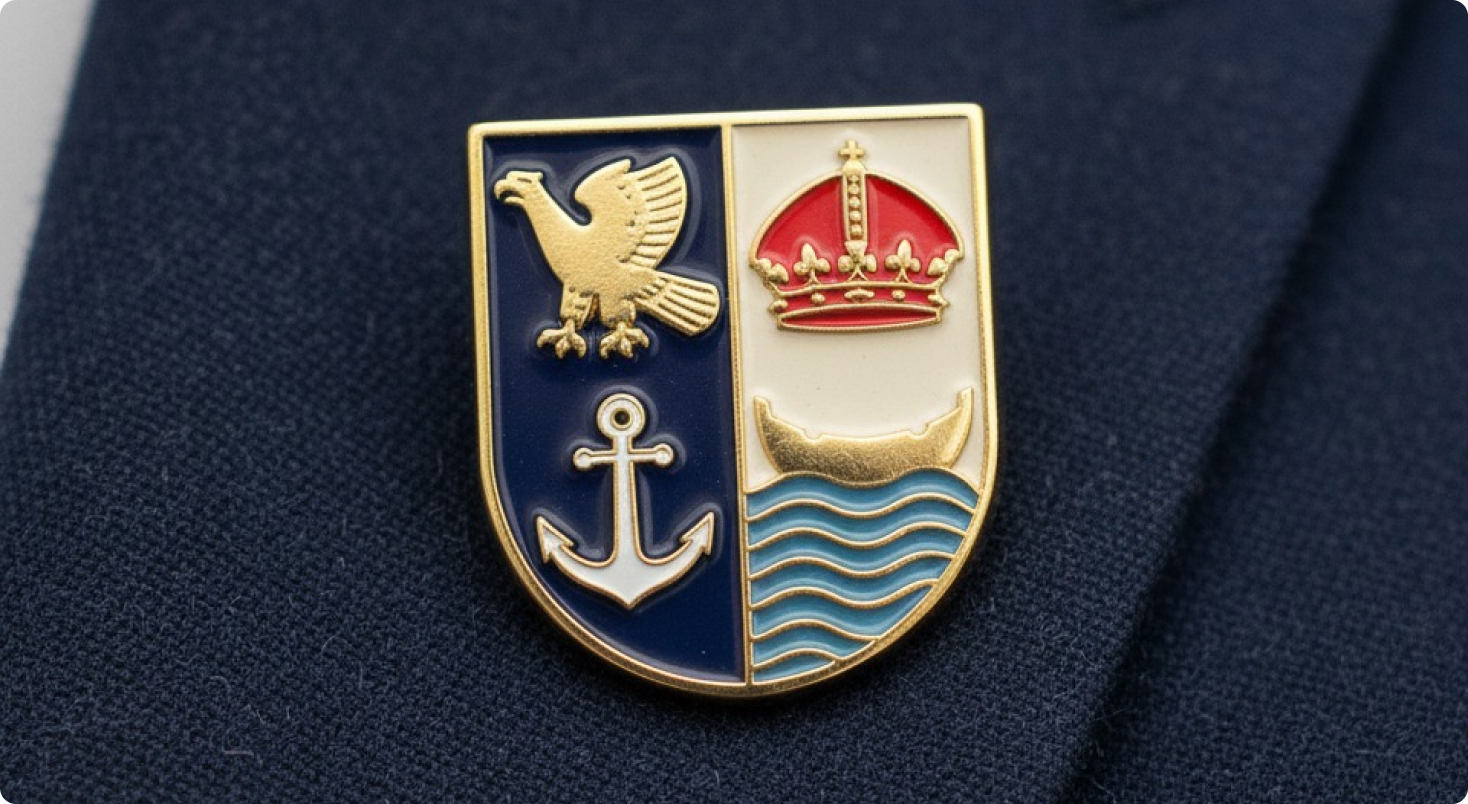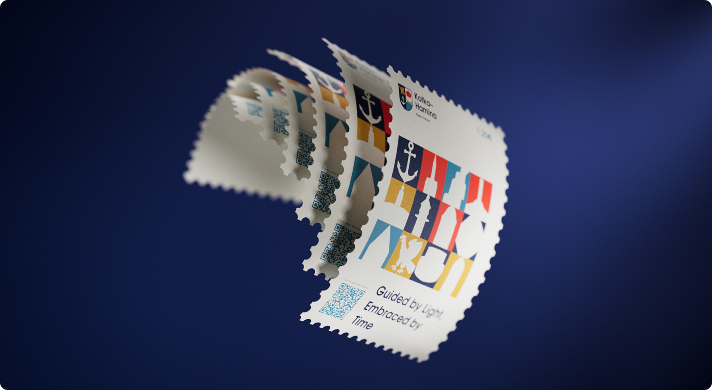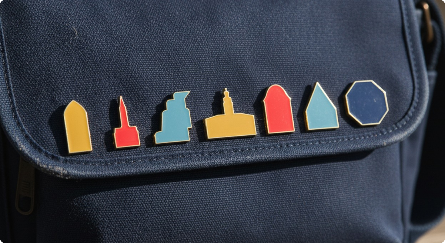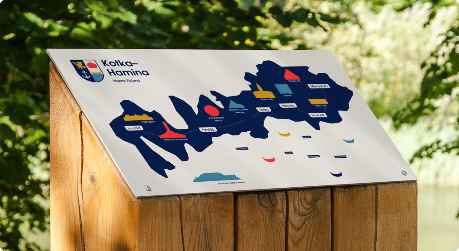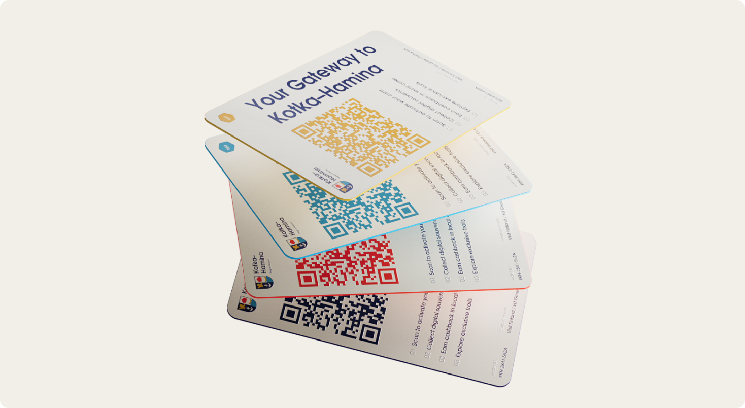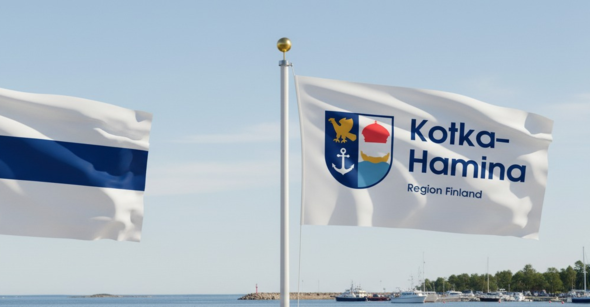
Kotka–Hamina is where harbors, fortresses, and pine shores meet. We built a clear, traveler-friendly destination brand: a shield logo, bold landmark silhouettes, postage-stamp graphics, visitor maps, and the Official Travel Card. The result is a calm Nordic voice that turns curiosity into an itinerary – from the website to park signage, every touchpoint guides like a quiet lighthouse.
task & context
The region’s visuals were fragmented across towns and languages – we needed one simple, friendly system that makes trip planning effortless.
Project goals
• Unite communications under one identity
• Make wayfinding intuitive
• Equip partners with ready-to-use tools
• Run multilingual campaigns with measurable impact
Target audience
• Families and weekend travelers
• Culture & nature lovers
• Cruise visitors and first-timers
• Local businesses and investors
idea & concept
Key idea:
«Harbors of history. Horizons of freedom»
The shield joins eagle, crown, anchor and waves; real buildings reduce to clean geometric icons. Postage-stamp tiles and a maritime-flag rhythm bind assets into one story that invites calm, confident exploration.
Inspiration sources: Baltic waves • Fortress plans • Nordic light • Maritime signal flags • Monuments • Landmarks • Buildings

